Zenergi is a UK based energy management consultancy, supporting and empowering organisations on their journey to net zero. They tailor sustainable solutions for all their customers.
Brand refresh and reinvigoration
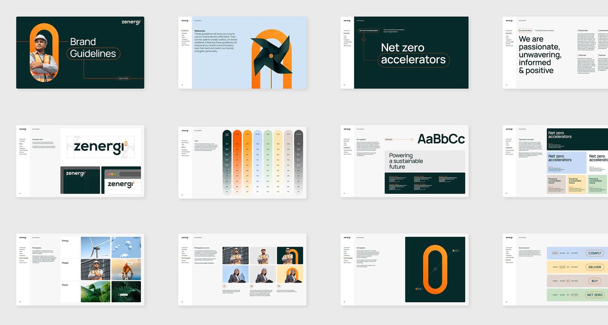
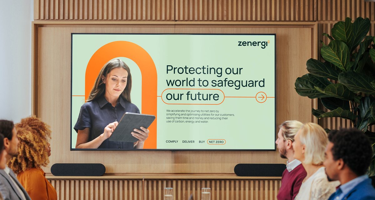
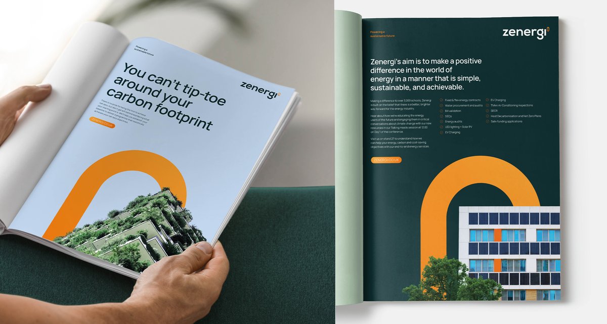
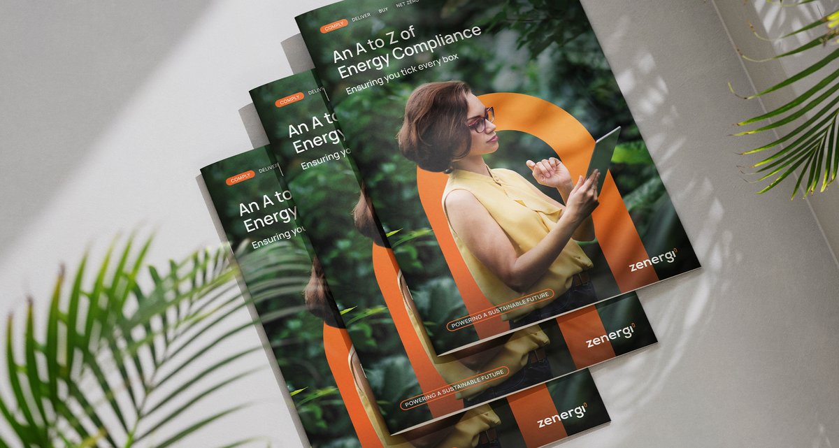
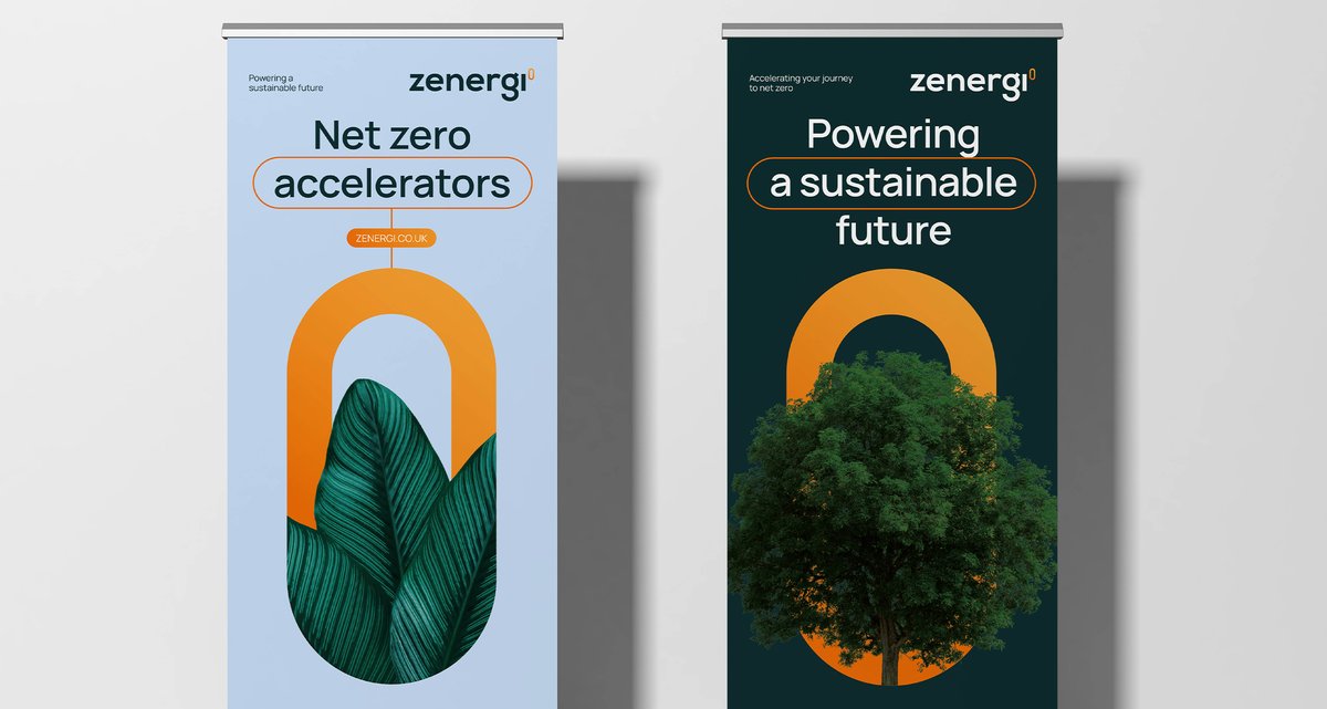
We created a new visual identity incorporating a distinct "0" symbol after the brand name. Drawing inspiration from mathematical exponents, this symbol signifies empowerment, reinforcing Zenergi's mission. The zero was also used as a super graphic reinforcing their focus towards achieving net 'zero' for their clients.
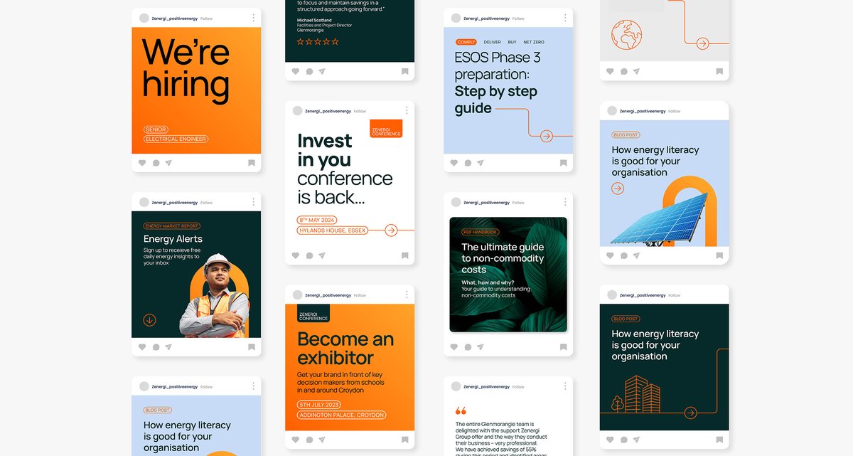
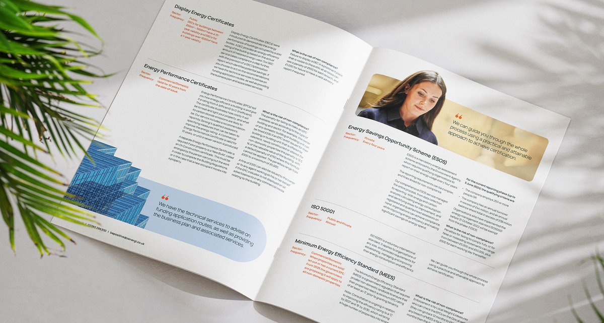
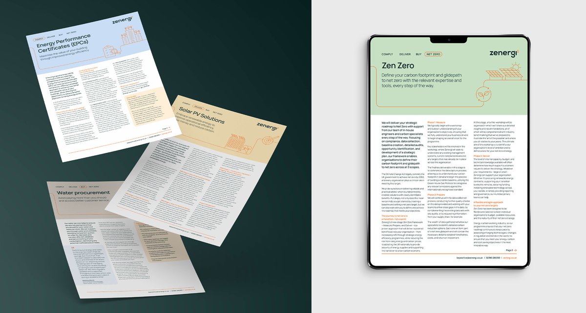
We explored a refreshed colour palette aligned with Zenergi's service offerings and introduced a journey line; a graphic element used to enhance the brand's storytelling capabilities. We refreshed the brand across various touchpoints, including video, social media, and product sheets.

Redefining Zenergi's brand DNA
Chaos stepped in to help Zenergi revamp their brand strategy, brand look & feel, website, and all their marketing materials. It started with us understanding the business through a series of 1-2-1 interviews to garner insights from across all services lines and a collaborative workshop session.
Chaos helped Zenergi create a new service descriptor - Net Zero Accelerators, reflecting their expertise in helping customers move towards their net zero ambitions. We successfully articulated a new brand DNA – build around their proposition to “Power a sustainable future”. Through this process, values and a personality were also crafted to align with Zenergi's culture and vision.

