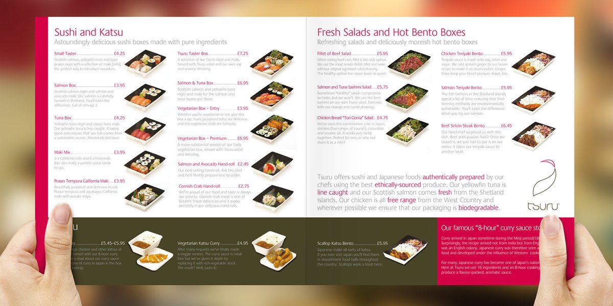
As fast food gets an update and the new healthy era of consumers want fresh ingredients and a quick quality service, Asian food still becomes even more mainstream and reimagined. Tsuru is one of the new chain of Japanese convenience ‘takeaway restaurants’ based in London with food freshly prepared on the premises. This small Japanese restaurant is essentially aimed at the takeaway crowd with its display case of branded ready-prepared sushi and salad boxes.
New London food chain branded by Chaos is food for thought.
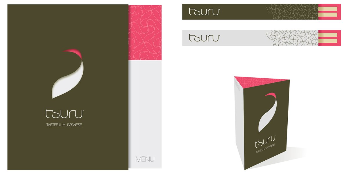
Colours and styling were chosen to evoke the oriental whilst appealing to London’s restaurant goers. Activating the brand across all marketing communications, we collaborated with and guided the restaurant interior designers to ensure a consistent look and feel and integrity of the brand’s role out.
Tsuru has extended the brand and subsequently opened a further four London restaurants as well as the original one near the Tate Modern.
A new sushi restaurant business needed branding. Their only ingredient was Tsuru – the Japanese word for ‘crane’. Bird name, fish restaurant – quite a branding challenge! Through true Chaos Thinking, we rose to it, combining fish and crane in an brand identity reflecting the elements of freshness and authentic Japanese styling suitable for this new restaurant branding. Creating an outline ‘crane/fish’ symbol which could be interpreted both ways, and a subsequent brand pattern, enabled us to style the new start up accordingly.