REDS10 is a modular construction company, focusing on educational, medical and government projects. Following a client recommendation, REDS10 approached Chaos to support them with a brand refresh (covering brand strategy, visual language and brand identity) which we then rolled out across a new website and printed collateral, such as hoardings, vehicle signage and stationery etc.
Creating a Brand Strategy for modular construction company Reds10
After 10 years, the REDS10 brand was already established in the modular construction industry – however, they saw an opportunity to push their branding and messaging to increase exposure and maximise their opportunity to work on the larger Government Initiatives. To do this, we needed to move away from traditional modular messaging and visual language, make the brand more personal/emotive and most importantly emphasise the innovation and uniqueness of the buildings REDS10 were creating. We needed to do this whilst staying true to the company, maintaining the integrity and reputation they had developed over the years.
After completing a competitor audit, the strategic team at Chaos were able to take the essence of REDS10 initial DNA and brand, then adapt, distil and re-articulate, reflecting points from the kick-off meeting but not adapted to competitor audit findings.
From this we were able to define the new REDS10 brand DNA.
Re-branding modular construction company Reds10
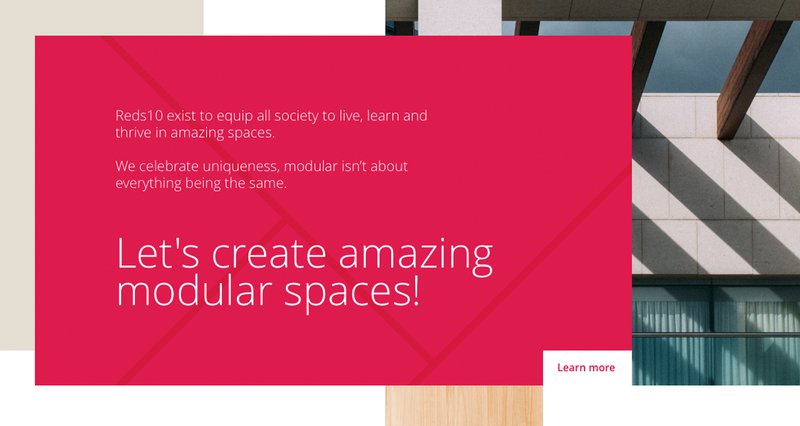
By taking inspiration from architectural detail and finishes, we wanted to highlight the versatility, quality and vast capabilities of modular construction to show how REDS10 brings their expertise to every project.
This idea created an energetic and adaptable identity, using imagery to put REDS10’s ability to create amazing spaces at the forefront of its thinking.
Our suite of dynamic tiles are inspired by architectural details from the interiors and exteriors of buildings. The variety in the tiles is a graphical representation of the intricacies and capabilities of modular building. Their simple forms make them highly distinguishable brand assets that can be adopted across a variety of brand applications. We use our tiles in sets of four. This signifies the four broader stages of our project process: Design, Build, Install, Maintain.
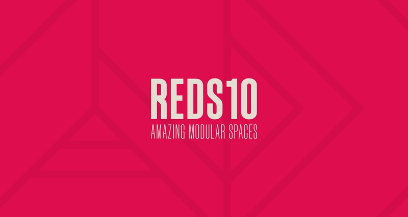
The REDS10 logomark is not a typeface and has been specially drawn. The logomark is the most visible element of our identity– a universal signature across all REDS10 communications.
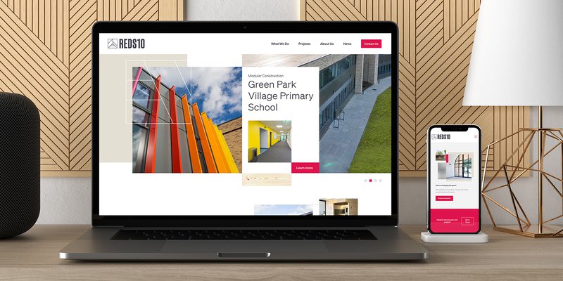
New brand website for modular construction company Reds10
Our re-design and build of Reds10's website brings to life the new dynamic branding. The site opens with an eye catching animated modular banner - inspired by the new messaging, "Let's create amazing spaces."
The site architecture and user journey was examined and improved to help audiences learn more about the company's services and browse through their impressive Portfolio.
The new design is light, open and airy - helping to deliver a sharp and professional aesthetic consistent to the brand’s values, as well as a fast loading website.