We’ve worked with the London Philharmonic Orchestra (LPO) since 2006 and have built a great working relationship. We deliver creative ideas and campaigns to support both individual concert promotions, key events and their annual season guide.
Marketing Comms campaigns
Over 140,000 copies of the guide have been made available throughout the UK to boost ticket sales, with mini guides planned for the LPO’s Brighton and Eastbourne seasons.
In developing the 60pp guide to showcase their 2013-14 season, LPO wanted to create a sense of drama and anticipation whilst reflecting their desired positioning as London’s premier orchestra.
Chaos developed a striking visual idea of taking iconic London backdrops and overlaying them with the individual players from the orchestra and their instruments.

Chaos Orchestrates New LPO Season Guide
In developing the 60pp guide to showcase their 2013-14 season, LPO wanted to create a sense of drama and anticipation whilst reflecting their desired positioning as London’s premier orchestra.
Chaos developed a striking visual idea of taking iconic London backgrops and overlaying them with the individual players from the orchestra and their instruments.
Over 140,000 copies of the guide have been made available throughout the UK to boost ticket sales, with mini guides planned for the LPO’s Brighton and Eastbourne seasons.

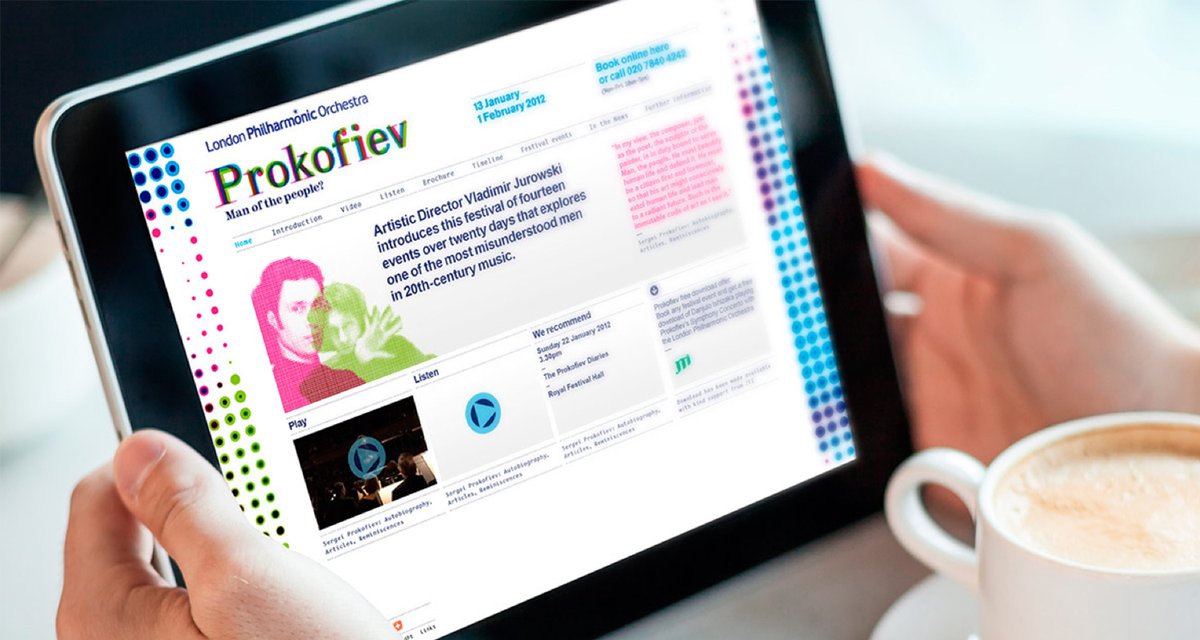
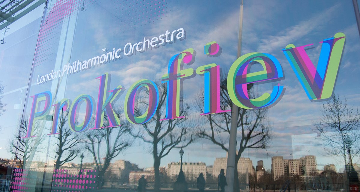
LPO has designs on Prokofiev
Vladimir Jurowski, the London Philharmonic Orchestra’s artistic director and Prokofiev expert, told us he did not want to simply draw on clichéd Russian symbolism.
Our striking design interpretation uses three portraits of Prokofiev at different stages of his life, reflecting how his music changed over time. The typography explores and develops this idea creatively. If you missed the concerts, take a look at the branding on the season microsite.


Chaos Composes LPO Rachmaninoff Marketing Campaign
Rachmaninoff was celebrated for his ability to play a 12 note chord, so a Chaos Thinking™ moment linked this with 12 letters of his name, turning corresponding letters in ‘Rachmaninoff’ into keys on the piano.
Chaos also used dynamic word clouds to portray the inner workings of the mind of Rachmaninoff, throughout a very colourful, eye-catching marketing material to engage and inspire new audiences.


