Since time immemorial, deer have been drawn to graze in the sheltered meadows, which line the banks of the river Dart in this Devonshire valley and quench their thirst in the cooling waters. For nearly a thousand years, people have been drawn to Buckfast Abbey too. Running up towards their millennium celebrations, we’ve been helping this charitable trust refresh its brand and move towards a more contemporary, yet still elegant look and feel. Branding and marketing the destination as well as the retail products.
Brand refresh and brand identity
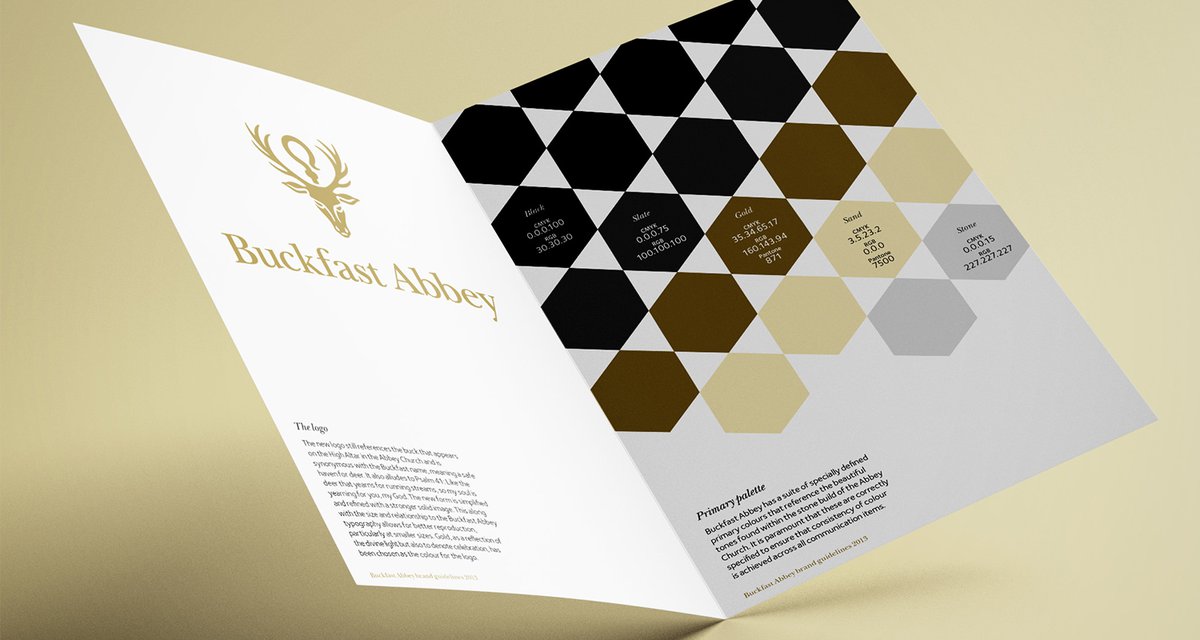
We developed a clean, elegant, understated and updated brand refresh and brand identity for the notable ancient Abbey. Creating brand guidelines and a new visual language has enabled the Trust to easily and affordably roll out signage, packaging and marketing communications.
Asked to update the branding for the monastic community and its business activities, the new logo references the buck that appears on the High Altar in the Abbey Church that is synonymous with the Buckfast name, meaning a safehaven for deer.
Gold, as a reflection of ‘divine light’ was chosen as it also denotes celebration. Graphically a suite of geometric patterns, inspired by the marble pavements in the Abbey, have also been created to act as a back drop to all communications.

