Babington is a training and qualifications provider for corporations, SMEs and individuals with over 40 years experience providing quality training solutions.
Brand Strategy for leading training provider Babington
Under fresh ownership, Babington faced the imperative to propel their business to greater heights, driven by ambitious plans for the future.
Chaos played a vital role in offering valuable insights into brand perception, encompassing both internal and external perspectives. These insights were instrumental in shaping the development of a well-defined go-to-market value proposition, targeted propositions for specific audiences, a fresh brand narrative, unique selling propositions (USPs), and compelling Reasons to Believe messages.
During the initial brand strategy phase led by Chaos, a new company Brand DNA was established, serving as both a guiding light and a creative brief for the brand refresh. The outcome is a revitalized brand that is uniquely distinctive, captivating, and strongly aligned with customer value, serving as the foundation for all visual and verbal communications. The brand now exudes a sense of ownership, empowering Babington to stand out in the market.

Branding for Babington, a leading provider of apprenticeships, professional training courses, and learning solutions
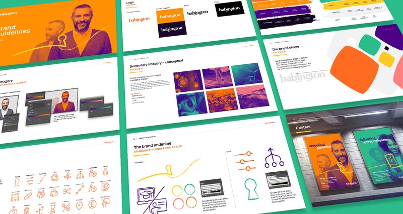
The redesigned Babington logo showcases a custom font that exudes a delightful blend of quirkiness and modernity. Notably, the special characters 'o' and 'i' take center stage, with the latter being particularly emphasized to symbolize the brand's commitment to personalization, placing the individual at the core of Babington's endeavors.
Embracing a vibrant personality, the new brand incorporates three primary colors: orange, mint, and rose. These warm, bold, and contemporary hues distinctively differentiate Babington from its competitors, harmonising seamlessly with other brand elements.
Additionally, the primary images featured in the new branding consist of duotone representations of the same individual, capturing a transformative journey from one state to another. These images embody the notion of progress and the realisation of potential, signifying how individuals attain clarity, confidence, and success through their engagement with Babington.

Website design and development for Babington, a leading UK apprenticeship and training provider
Following the branding phase, Chaos embarked on a comprehensive website redevelopment project, placing user experience (UX) at the forefront...meticulously identifying and preserving historically successful content while revamping and redefining elements that impeded positive user journeys.
To empower the Babington marketing team, a versatile design system was created, enabling the effortless creation and management of content-rich "lead generation" pages. The revamped WordPress build seamlessly integrated eCommerce functionality and connected with Babington's chosen marketing automation platforms, CRM, and applicant tracking system.
The outcome has been remarkable, with the website witnessing a substantial increase in traffic, extended dwell times, faster loading speeds, and a surge in lead generation with enhanced lead quality. Chaos continues to collaborate with Babington, employing an ongoing test and measure methodology to continuously enhance the website's performance.

