ACE & Company ("ACE") stands as a dynamic private equity and venture capital group, distinguished by its founders and team's unique blend of expertise, experience, and knowledge.
Brand Strategy for Multi-Stage Private Equity Firm, ACE & Company
Chaos conducted in-depth stakeholder interviews at group and individual strategy levels, uncovering historical contexts, current challenges, drivers, and future aspirations. A brand perception survey also gauged sentiments towards the current brand and future goals. A workshop with strategy heads was organised, presenting interview and survey findings and conducting exercises to formulate the appropriate brand architecture.
The consensus was established on the significance of all three strategies working cohesively under the overarching brand, ACE & Company. The company aimed to portray itself as a unified entity with one culture while allowing each strategy a degree of independence. A new identity was envisioned to represent the business's ambition and forward-thinking nature, balancing independence where necessary.
A brand architecture was devised, designating ACE Ventures as a sub-brand, while the other strategies would align directly with Group branding. The brand strategy emphasised ACE & Company as a unified organisation with a single overarching proposition. Distinct descriptors and value propositions were defined for each strategy, complemented by individual words setting the tone for strategy-specific outputs and audiences.

Branding a Global Private Equity and Venture Capital Group
To visually bring to life ACE & Company's ability to transcend the confines of the traditional investment landscape, we explored Topography as a theme. Topography, the study of land surfaces, provided a metaphor for ACE's deeper understanding of growth opportunities. The visual language paired landscapes and parts of cityscapes with overlayed topographical lines going beyond the image, symbolising ACE's profound insights into growth opportunities.
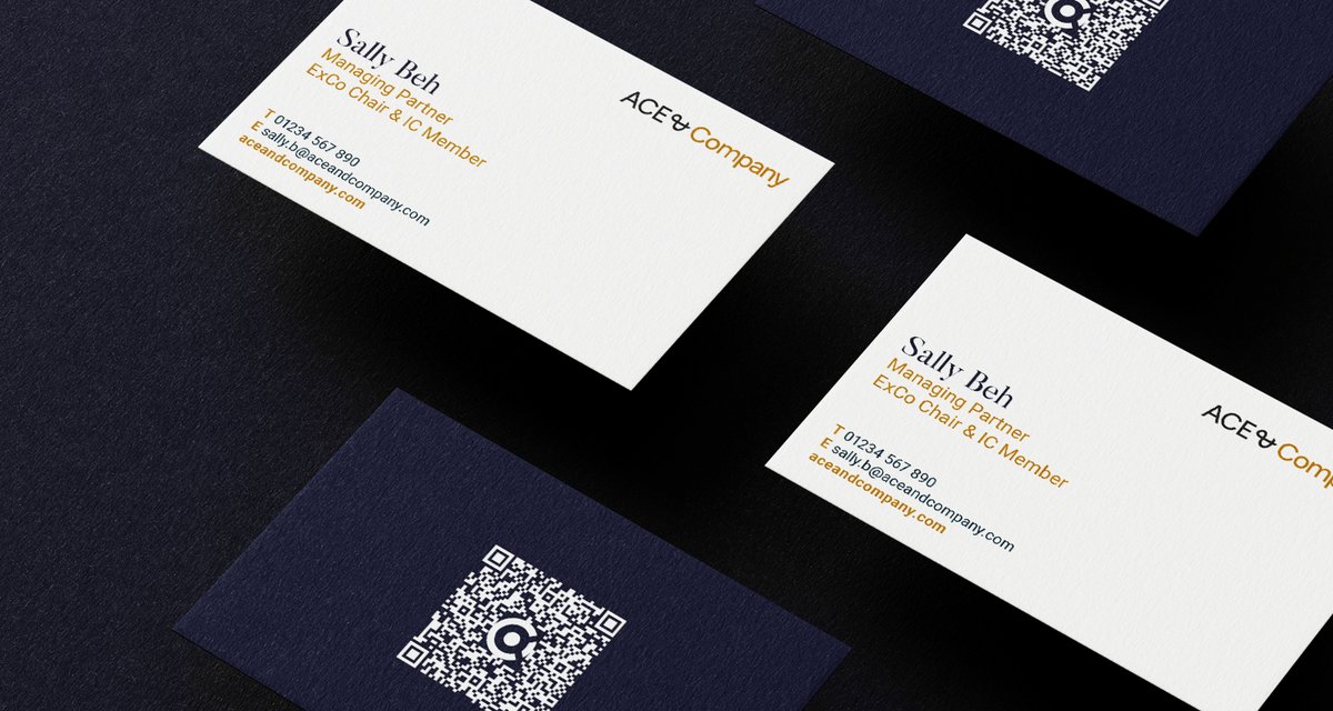
The existing logo underwent a modern transition, adopting a fluid, confident sans-serif font. The colour palette was refreshed, deepening the bronze to a more golden hue and introducing a bold navy blue and Stone combination. A brand methodology was established to create new sub-brands that would always maintain a sense of visual and verbal unity in the broader group as well as create a future-proof system going forward.
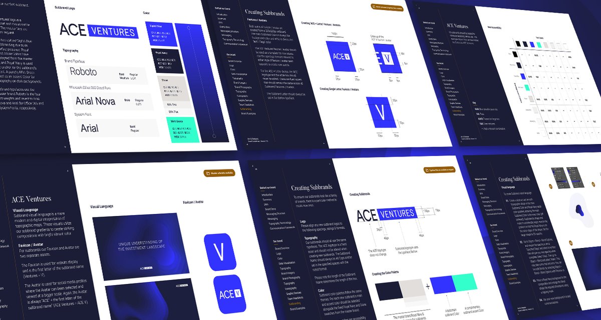
For ACE Ventures, with its significant online presence and different target audience, a bespoke logo using a bolder digital-first Blue was created. Colours from the master brand were incorporated, and a more modern, digital interpretation of topographic maps formed the visual language. The overall result is a confident, sophisticated brand with clear guidelines for presenting and communicating both as a whole and as individual strategies.


