Nordic Capital are a Private Equity firm based in the Nordic region but with a global reach. They were looking for a partner who could help better explain to their various audiences who they are and what they do, through strong branding and design across their website and corporate communications.
Nordic Capital's new website
Nordic Capital's old website lacked visual engagement and was extremely text heavy, representing their analytical approach. There was little or no visual identity to talk of.
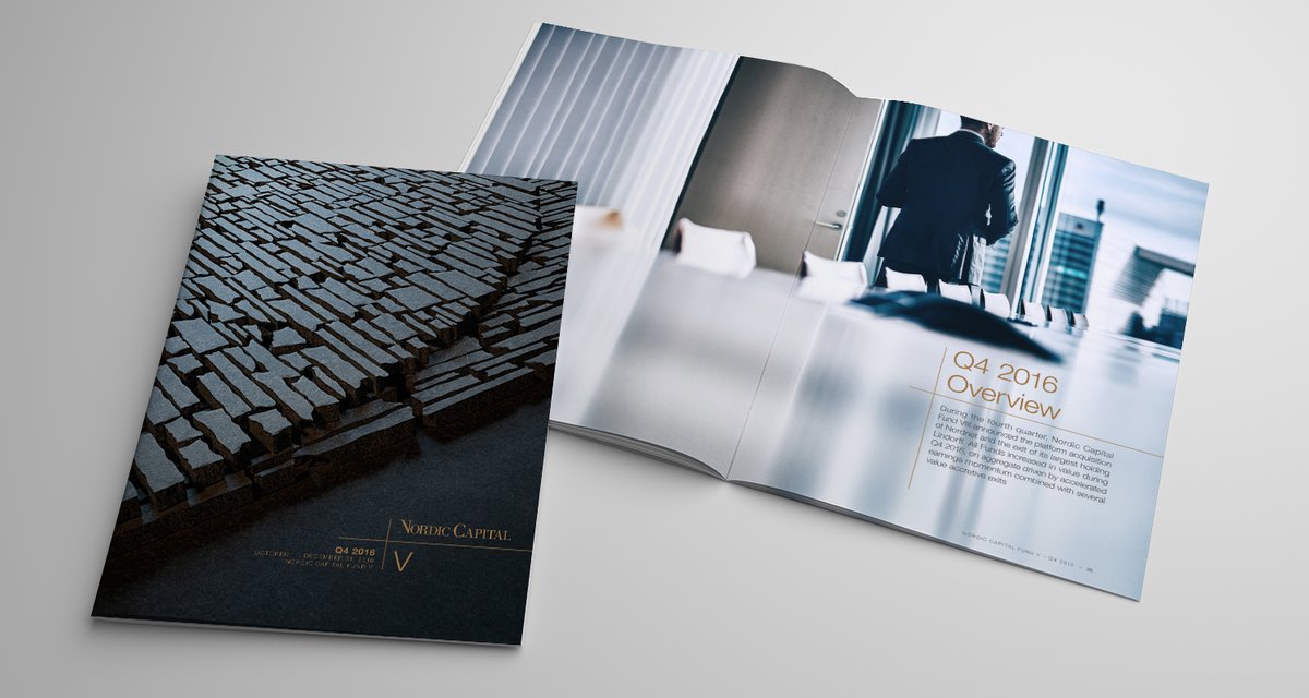
Having developed their new identity, Chaos inventively designed their website to incorporate the strong nordic stones and nordic cross visuals, so that every page had impact and surprise, from brand videos with clever infographics to clear diagrams to explain the sometimes complex world of Private Equity.

Laying the foundations of new brand for Nordic Capital
Successfully injecting Nordic Capital's brand with personality and a premium quality.
Nordic Capital's brand and indeed most of the PE sector conveyed very little brand personality, so there was a huge opportunity to make a mark and stand for something.
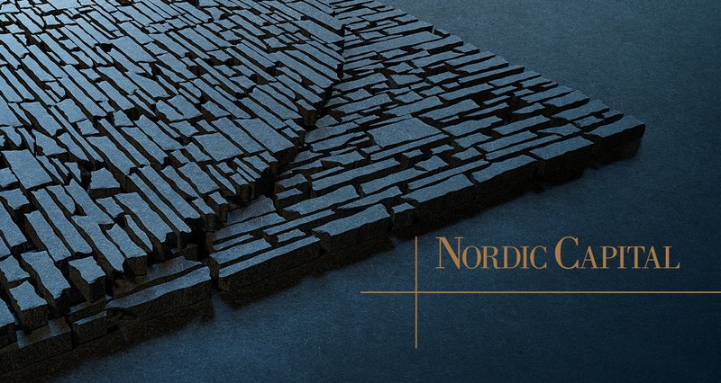
Through Chaos Thinking, we developed an extremely impactful nordic stones visual identity. This worked alongside the key messages around building strong foundations for businesses and creative reorganisation to add value. The darkness of the stones tied in to the premium nature of other brands associated with the colour black.