Bishop & Sewell is a 30 year successful well established mid-sized London law firm which has enjoyed steady growth over the years but its identity and website was last updated over 10 years ago.
However, the firm also had an inconsistent look and feel online and offline and lacked any distinctiveness within its sector and target market. Serving clients in London and the South East, increasingly the firm is being instructed by those further afield and internationally.
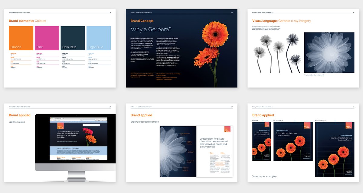
Making rebranding a London law firm beautifully straightforward
The senior partnership team chose Chaos to undertake a brand refresh of the firm's identity to enable it to standout in an ever competitive and crowded legal marketplace and to develop a creative strategy to reflect, resonate and be a balance with both Business & Private and equally work with Property clients. This was also to coincide with the law firm’s merger and acquisition with Fisher Meredith.
After reviewing the brand DNA, further brand workshop discussions, reviewing the competitor brandscape, applying insight and inspiration, Chaos developed refreshed the brand and creative strategy based around a new proposition ‘beautifully straightforward legal advice’.
We introduced the beautifully simple and elegant flower - the Gerbera - as an analogy and striking visual language. This enabled us to create a very distinctive and highly ownable unique look and feel. Supported by two word ampersand headline treatment inspired by their name… Bricks & Mortar (property), Tooth & Nail (litigation) Beck & Call (service) etc.
A highly successful rebrand that has given the law firm more stand, confidence and led to greater traction with existing clients and increased enquiries.