PER
PER is a London-based Private Equity Recruitment firm. Following an RFP and pitch process, we were appointed to help with their brand strategy, branding, advertising, website and marketing communications.
PER advertising
The brief was to make PER stand out in a sector rife with stock imagery of besuited businessmen and women amongst modern office environments in stereotypical poses. Chaos made said business people fall out of the sky in a visually arresting way, on a back drop of elegant pastel colours. This ensured PER would stand out from all their competitors and maintain their premier status in their sector.
"Chaos have lived up to our expectations - they presented a winning pitch at the beginning of the process and by taking logical and insightful steps along the way, they have produced work that we and they can be proud of." Gail McManus, MD

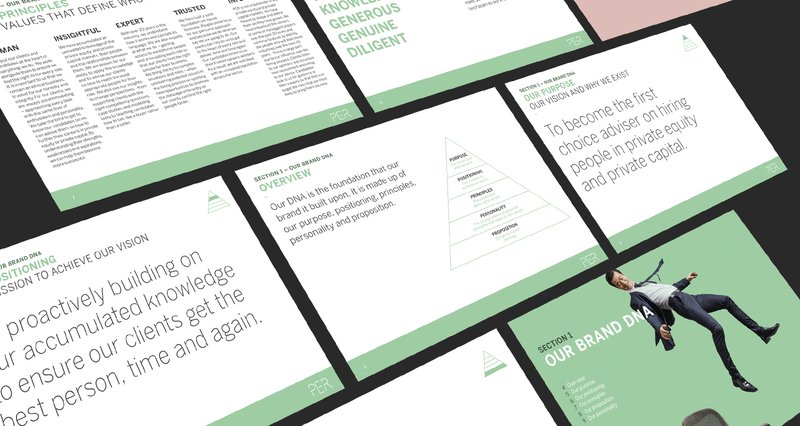
PER brand strategy
PER were starting to get outshone by their rivals in an extremely competitive marketplace. Their brand was looking tired and no longer represented who they were and their premier position in the marketplace.
Chaos took them back to basics by running a workshop with key stakeholders on what their company stands for, their values, vision and mission and value proposition. From this, Chaos developed their go-to-market proposition – "the right people for securing the right person".
PER branding
Having developed their new brand strategy, Chaos used this as a basis to develop a visually striking falling people idea, as a fun and engaging metaphor for their business that reflects their brand and company values.
This treatment brought to life the idea of securing the right person by delivering them into a new office chair. This fun and modern approach was enhanced by a backdrop of stylish pastel colours.


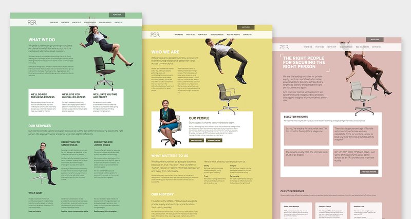
PER - A website to be proud of
PER's old website lacked strong, engaging imagery and needed to refocus on what matters - attracting clients.
Chaos relegated the candidates' content to a specialist portal and instead let the new falling people brand idea shine to attract new clients.
Each section was coloured up in the new pink, yellow and green brand colours to help navigation but also to make an impact. To keep things dynamic, the falling people shots scrolled in parallax so they seemed to be falling into their chairs.